
2026 Web Design Trends Dominating Toronto: Stay Ahead of the Curve
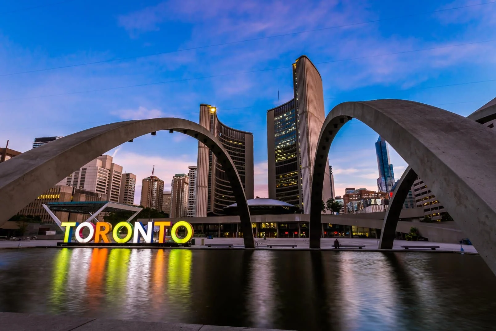
As we move through the middle of 2026, Toronto’s digital marketplace has never been more competitive. From the bustling tech startups in Liberty Village to the established corporate institutions in the Financial District, local businesses are realizing a critical truth: a website that simply “looks nice” is no longer enough to survive online.
Every website serves as the digital front door to a business long before a customer ever initiates direct contact. Today, user experience (UX), page speed, strict accessibility compliance, and interactive functionality influence consumer decisions just as much as visual aesthetics. To capture local market share and build true online domain authority, your website must seamlessly blend cutting-edge creativity with flawless technical performance.
If your website hasn’t been updated recently, it is likely falling behind. Let’s look at the web design trends dominating Toronto in mid-2026 and how you can leverage them to outrank your competitors.
1. Ultra-Minimalism and Strategic White Space
The trend toward clean, uncluttered layouts has reached its peak in 2026. Toronto businesses are moving away from dense paragraphs and overwhelming graphics in favor of ultra-minimalism.
By utilizing generous white space and sharp typography, you guide a visitor’s attention naturally toward your core messaging and primary calls to action (CTAs). This structural clarity eliminates decision fatigue, allowing prospective clients to navigate your site confidently while associating your brand with modern elegance and professionalism.
2. Uncompromising Mobile-First Architecture
Mobile responsiveness is no longer an optimization checklist item, it is the baseline of modern development. With the vast majority of local Toronto web traffic originating from mobile devices, sites must be planned, wireframed, and designed with a mobile-first approach.
This means implementing touch-friendly buttons, highly readable fluid typography, optimized responsive images, and intuitive, thumb-accessible navigation menus. A flawless mobile experience keeps users browsing longer, driving up your “dwell time,” which sends highly positive signals to search engine algorithms.
3. High-Performance Optimization (Speed as an SEO Asset)
In mid-2026, website speed is one of the most critical factors determining user retention and search engine rankings. Slow-loading pages cause immediate frustration, leading to high bounce rates that actively damage your domain authority.
Top digital experiences achieve lightning-fast loading speeds by focusing on:
- Advanced image compression (using next-gen formats like AVIF).
- Code minification and clean, lightweight CSS/JavaScript.
- Server-side rendering and highly efficient local hosting compatibility.
- Reduction of bloated third-party scripts and plugins.
4. Subtle Micro-Interactions and Visual Feedback
Micro-interactions are small, functional animations that provide immediate visual feedback to a user. Think of a submit button that smoothly shifts to a checkmark when clicked, a subtle hover effect on a services menu, or an elegant progress indicator during a form submission.
These minor details humanize your website. They reassure users that their actions have been registered by the system, reducing friction during form completions, registrations, and e-commerce checkouts.
5. Accessibility-First Design (AODA Compliance)
Designing an inclusive website is both a ethical necessity and a legal requirement for businesses in Ontario under the Accessibility for Ontarians with Disabilities Act (AODA). In 2026, accessibility-focused design is fully integrated into the creative workflow rather than treated as an afterthought.
An accessible website features robust keyboard navigation, high color contrast ratios, clear focus indicators, logical heading hierarchies, and descriptive alt-text for screen readers. Beyond compliance, accessible design inherently improves the structural usability of your website for every visitor.
6. Native Dark Mode and Flexible Viewing
Flexible display settings have evolved from a trendy novelty into an essential UX preference. Integrating a seamless dark mode toggle gives users greater control over their viewing environment, reducing eye strain during late-night browsing and conserving device battery life.
Implementing dark mode requires a thoughtful, secondary color palette that preserves your core brand identity while maintaining exceptional readability and contrast against dark backgrounds.
7. Bold, Purposeful Typography
As minimalist designs clear away unnecessary visual clutter, typography has stepped up to carry the weight of a brand’s personality. Toronto websites are increasingly relying on massive, expressive, and custom headlines to make an immediate statement.
Paired with tight, impactful copy, bold typography creates an instant visual hierarchy that hooks the reader’s attention within the first two seconds of a page load.
8. Custom Brand Visuals Over Generic Stock Media
The era of forgettable, corporate stock photography is officially over. Savvy consumers can spot generic media instantly, which subtly erodes brand authenticity.
To cultivate true digital authority, local companies are investing in personalized visual assets. Custom vector illustrations, tailored icon sets, and high-quality local photography communicate a unique brand story that cannot be replicated by your competitors.
Choosing Trends That Drive Real Business Growth
Not every design trend is right for every business. Forcing heavy 3D graphics or excessive interactive tools onto a website can backfire if it slows down performance or confuses your target audience. The trends that provide the highest return on investment are those that prioritize the user: speed, clarity, accessibility, and intuitive functionality.
When you focus on solving real problems for your users, search engines notice. A technically flawless website that satisfies user intent is exactly what Google rewards with higher rankings and increased domain authority.
Build Your Next Digital Asset with Macroblu
Navigating the rapidly shifting world of modern web design requires local expertise, seasoned strategy, and meticulous technical execution.
For over 20 years, Macroblu Website Design Agency has been helping Toronto businesses design, develop, and scale high-performing websites. Strategically located at 140 Yonge St, Suite 200, in the heart of downtown Toronto, our expert team specializes in custom WordPress development, premium UX/UI design, and robust local Search Engine Optimization (SEO) strategies.
We don’t just build beautiful websites, we design powerful, secure, and compliant digital marketing tools tailored to your unique business goals.
Ready to outrank the competition and elevate your digital presence in 2026? Contact the Macroblu team today for a custom proposal. Let’s build something meaningful.
Let’s build something meaningful.
Strong digital results come from strategy, experience, and thoughtful execution. Get in touch with us to explore how we can turn your marketing efforts into measurable growth and lasting impact.
Get Your Custom Proposal